Watch me try to churn through as many costumes as I’m physically able before the year ends. While simultaneously trying to document them in as cohesive a level of detail as can be mustered (did you know it takes anywhere from 3 days to a month to get these blog entries into a state where I’m comfortable enough to post them? Well, now you do).
Some months ago MaEmon introduced me to Disney’s Gravity Falls animated series, and it really did not take much to get me hooked.
Naturally, when I enjoy something, my first instinct is to start working on some cosplay. But man, it was not easy to settle on a Gravity Falls character! Mabel is pretty adorable and while watching Tech Support made several comments along the lines of “Mabel acts just like you” which made her a tempting choice. Wendy was also relate-able for reasons I don’t want to go into from fear of embarrassing myself. Heck, I even tossed up the idea of cosplaying Robbie thanks to his bad haircut, jerk attitude and tight pants.
But in the end I settled on Dipper because… I make a very convincing pre-teen boy…? Yeah, I don’t know either. He’s kind of awkward and that appeals to me on a deep and profound level.
The costume itself is basic stuff- but don’t be fooled, basic costumes are often a lot more tedious because you have to get everything right. Cut corners in a complex costume? It’s unlikely anybody will notice because there’s enough going on to distract from any errors. But in a basic costume? Any off details will be glaringly obvious.
Down to business:
The shoes are black and white canvas sneakers which were already in my wardrobe. Socks are plain bleached cotton which were picked up from a local store and painted using acrylics with a textile medium (utilising strips of masking tape in attempt to keep the edges straight).
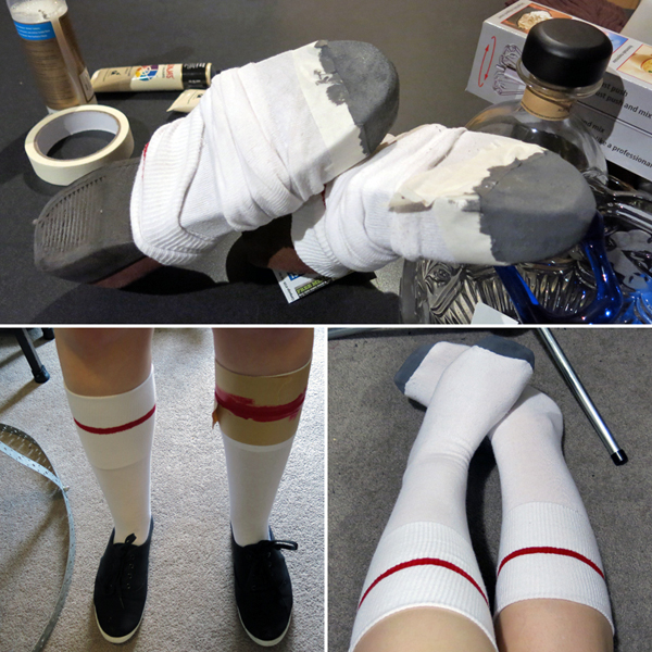
Painting the stripe was simple enough, but to get the toe I felt they needed to be padded somehow and ended up shoving a shoe in there to hold the shape as I worked. While successful, it made me feel weird about my life choices.
The blue and white cap was picked up from Daiso (my favourite dollar store) while the rest of the clothing came second-hand from local opp-shops.
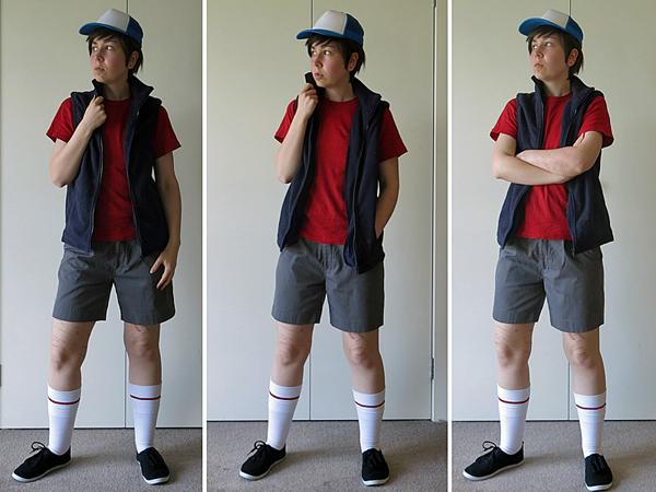
The shorts are a little shorter than I’m ordinarily comfortable with.
A few minor adjustments were made to the top and shorts, but nothing particularly noteworthy- mostly just removing visible labels and branding.
The vest however, began life as a full sweater; sleeves were removed, armholes widened, and raw edges bound utilising fabric salvaged from the discarded sleeves.
The tree decal for the cap was cut from some scrap fabric I had on hand, interfaced with a lightweight fusing, and hand-stitched to the centre front panel.
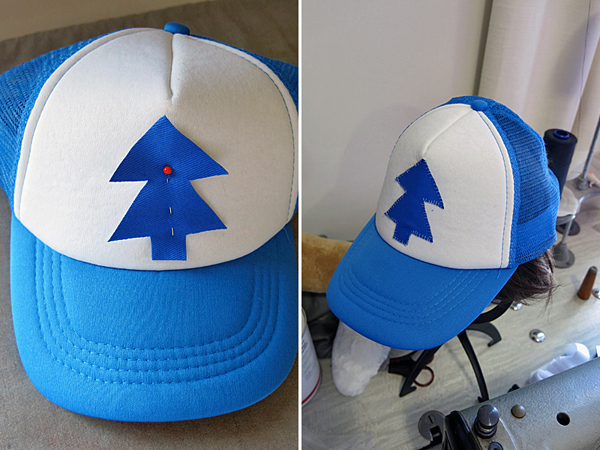
Hat progress.
The notebook… or journal… or diary… or… whatever you want to call it, is where all the real effort was spent. Also a lot of incoherent flailing because clothing is one thing but props make me nervous.
It was an A4 sketchbook… or is an A4 sketchbook, I mean, it hasn’t really stopped being that. Right…? … Right?! Uh… Well, in any case, it is hardbound, has 150gsm paper, and came from a local dollar store.
To begin with I painted the cover (which was originally black) with a few messy coats of greyish-red acrylics. Once dry it was sealed with a matte spray, more drying, then covered with red cotton/polyester fabric using PVA glue.
The fabric was cut to size so that the edges fold down onto the inside of the book’s covers. Not wanting the raw edges of the fabric to be visible on the inside covers, I took the very last page of the book and glued it to the inside back cover. For the inside front cover an A4 sheet of plain printer paper was used.
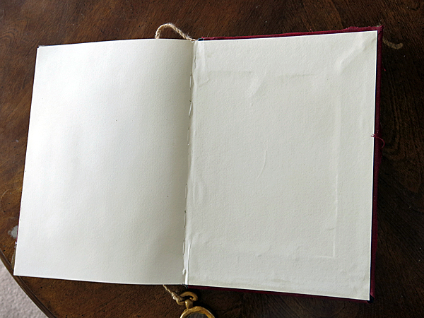
The last page in the book has been glued to the inside of the back cover.
Next up several rips were torn into the fabric, which also shredded layers off the paint in more than one spot. Prior to making the tears I marked out their positions using a permanent marker, at that point I also marked out the images on the back cover and lines of the spine.
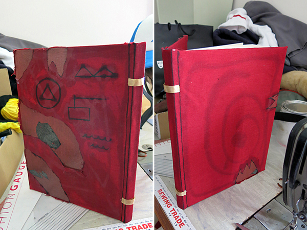
Gold polyester ribbon was affixed to the spine via hot glue.
The “magnifying glass” thing is a sheet of plastic, which came off some kind of packaging, cut into a circle and cased with polycaprolactone. The “lens” was then haphazardly covered with masking tape and case painted with gold enamel spray, before being finished with matte sealant. Once dry the tape was able to be removed.
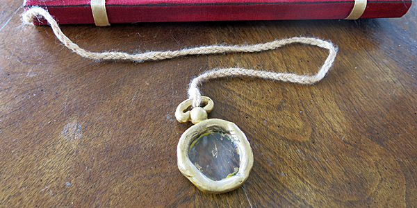
Magnifying glass.
The cord affixing the magnifying glass to the book is plaited acrylic yarn, slightly more than twice the length of the spine (it threads through from the bottom of the spine right up to the top and is held in place at both ends by hot glue) which has been firmly tied to the handle at the top of the glass, with a small amount of glue for added stability.
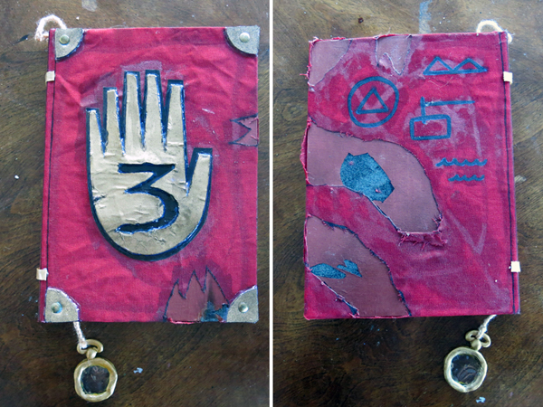
The images on the back cover were painted over with acrylics and a textile medium, as the marker initially used was not dark enough against the grubby, tattered fabric.
The corners and hand on the front cover were cut from craft foam and painted with gold enamel spray prior to being attached to the cover (the number 3 was also cut from the hand at this time). Once dry, the corners were attached to the cover using PVA and hot glue. The round studs are regular thumb-tacks which were simply pressed in and then had their points bent back.
Prior to attaching the hand, a slightly larger black paper hand was first affixed and sealed in place, once this was dry the foam hand with the carved three was affixed over it with hot glue and, once dry, the entire cover was able to be sealed.
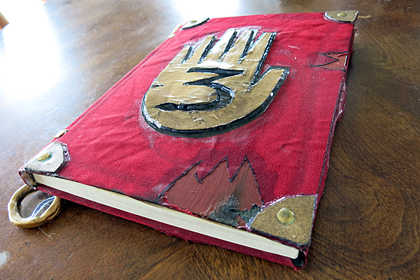
Journal 3, front cover.
As for the inside front cover, the first two pages in the sketchbook were damaged by burning, tearing, tea and coffee, wax and dust from burned out incense, after which the first page was glued to the inside of the cover, over the plain A4 page which was already in place.
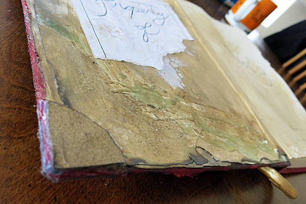
Journal 3, inside cover. A sheet of A4 paper was attached inside the cover to conceal the raw edges of the fabric, and first page of the book later affixed over that, so there are two layers of tattered paper without revealing the edges of the fabric from the cover.
For the “Property of” label, an A4 sheet was neatly torn in half, borders and writing added with black gel pen, then messily torn in half again, scrunched up and rubbed with dust, before being fixed inside the cover with PVA and adhesive tape.
Two foam corners were then added with the same method as those on the outside of the cover, sans studs.
“Vol.3” and the random scribbles were drawn on the adjacent page with black gel pens, at which point the entire inside cover was ready to be finished with a coat of matte sealant spray.
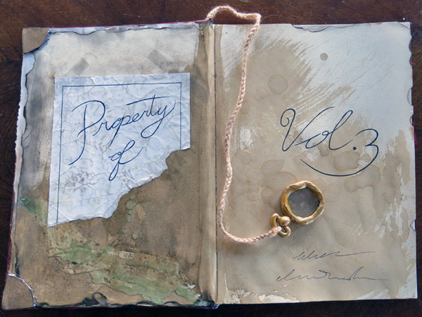
Journal 3, inside front cover.
At this point I considered the costume more or less “finished” and took some photos for the gallery:
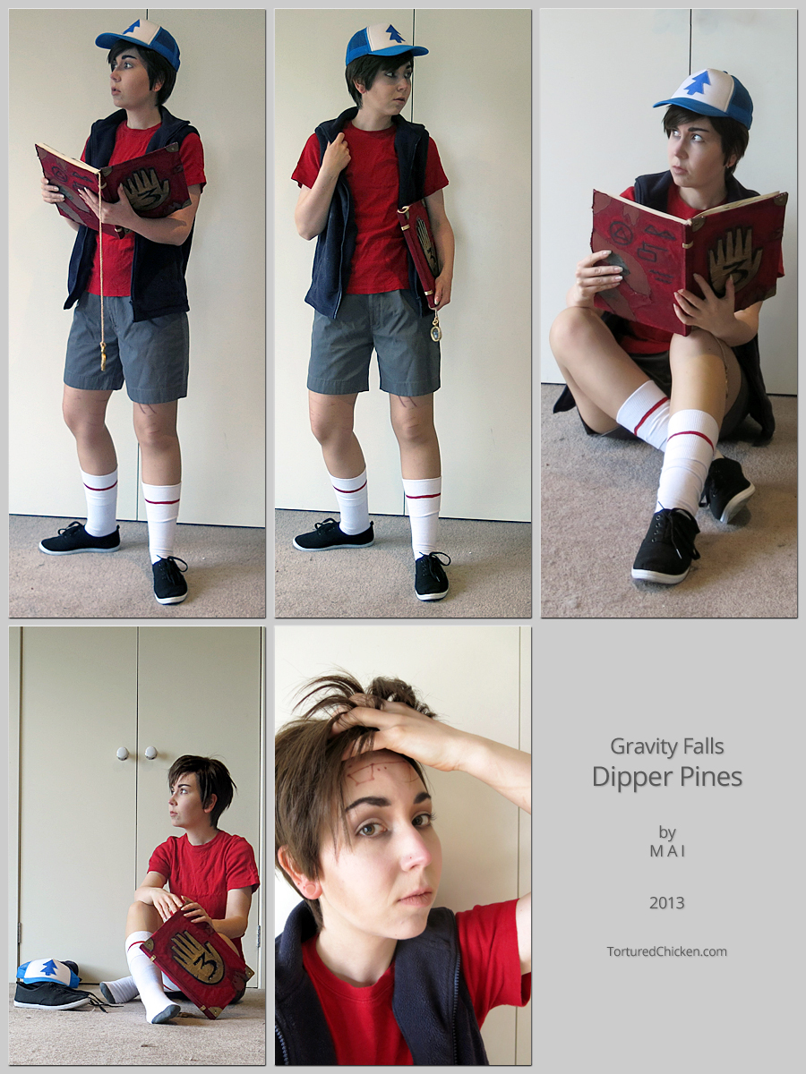
The birthmark may or may not be backwards because I don’t really understand mirrors.
However, Journal 3 is not actually finished quite yet. With the cover completed it’s good enough in a pinch, but I do intend on filling out all of the pages in as much detail as possible when I have the time. So please look out for that in the (hopefully) not-too-distant future!
