People who don’t understand geometry: me.

So nothing much has changed since school, really.
Somewhere along the lines I decided it’d be fun to cosplay Tweek from South Park (for deeply personal reasons that we won’t go into today, but probably will at a later date). Probably because that stupid game has me back into South Park in a big way. Tweek isn’t even the only character I want to cosplay; he just seemed like the easiest to throw together in my spare time.
This assumption was both right and wrong; working on his shirt- a really basic shirt- was a series of loosely strung together disaster and failure, culminating in the destruction of an iron (I destroyed a toaster this week also, please don’t leave me alone with small appliances) and ultimately leading to what was done of the shirt being tossed in the trash.
So… yet again I’m without an iron. Made ever more frustrating this time around because I have not one but two industrial style gravity feed irons which I can’t actually use because of reasons that are far more convoluted than they relistically should be.
Speaking of which: I don’t suppose anybody is interested in purchasing a gravity feed iron? Having one collecting dust in the cupboard is bad enough, I really need to get rid of the other. The silent taunts are becoming unbearable.
Thankfully, the printer has my back and while shirts are a no for the time being, labels for take-away coffee cups are 100% yes.

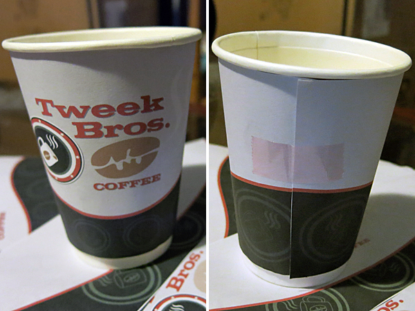
Things I don’t want to talk about: the amount of tests and mock-ups printed before success was achieved.
This project taught me that I need better hobbies. Ones with less trigonometry. Because apparently I don’t understand triangles or circles at all.
Pr0 tip: Start with a straight-up rectangle, trapezoids are full of lies and slander.
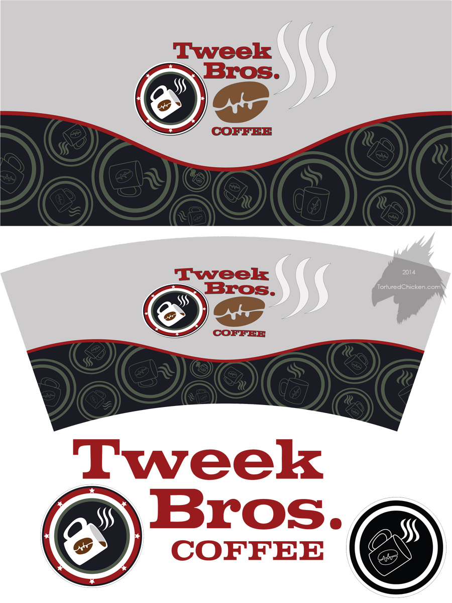
The label was drawn up using vectors, because despite my tenuous comprehension of mathematics vector shapes somehow make perfect sense to me (when they’re not being wrapped around coffee mugs, at least).
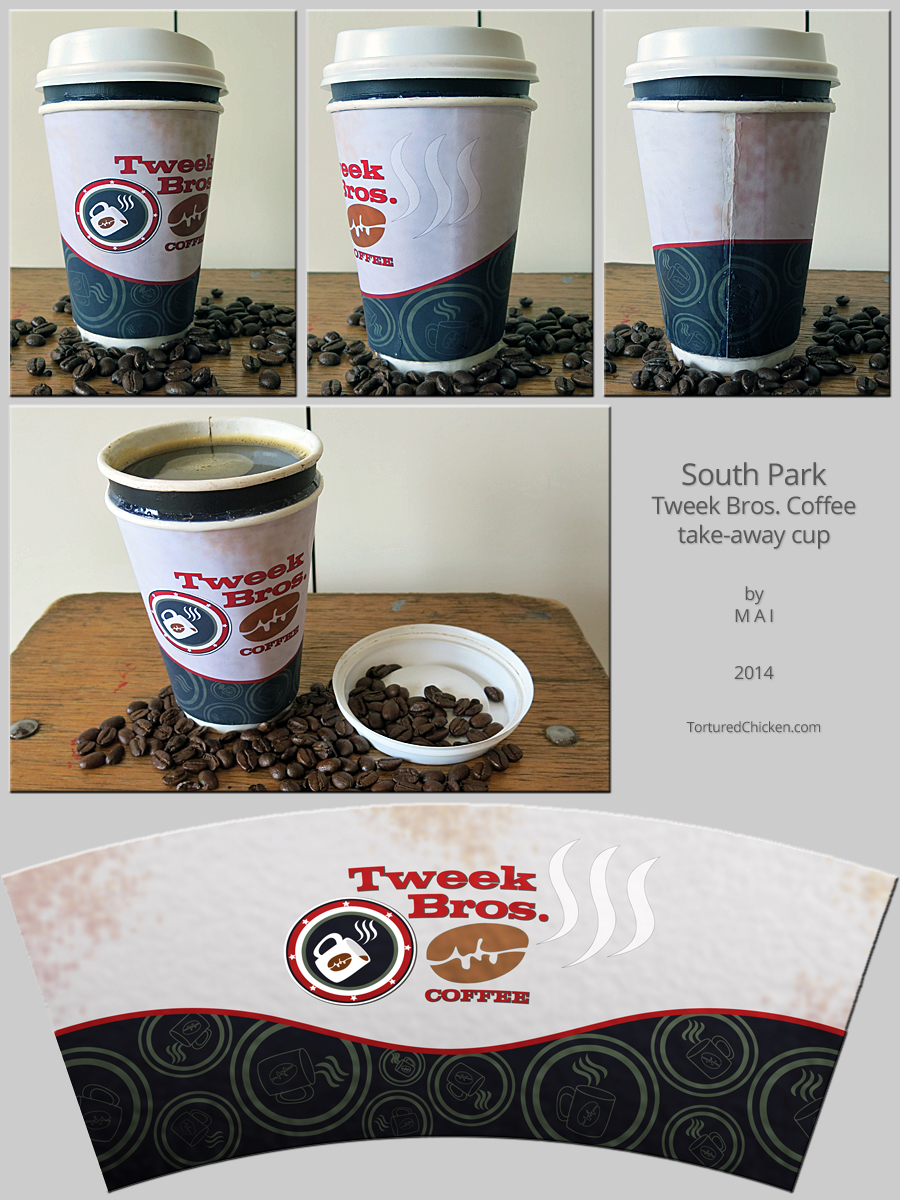
Some grubby textures were added once the shaping had been perfected and the final was printed on matte photo paper, carefully cut out, glued onto a paper mug I had on hand, before finally being sealed.

You can acquire paper “to-go” cups in a variety of sizes from pretty much any café.
The colours, logos, and font were all based on those featured on the Tweek Bros. coffee shop in the Stick of Truth game, while artistic liberties were taken for the layout because I was unable to find any specific, consistent, canonical references for their take away cups (in fact the design of the coffee shop when seen in the show has been quite different to that in the game; but considering the inconsistencies prevalent in the show and reasoning behind this… why am I trying to justify the design choices of a throw-away cosplay prop?).

There’s actually two cups, one painted black has been fixed inside the one with the label. It makes it look bigger and also offers more insulation. Because I fully intend on drinking from this thing.
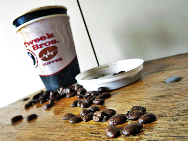
As an aside: that matte photo paper is impressive, being completely incompetent I spilled the drink everywhere and while the label has been landed with some stains, it did not smudge or tear at all! What a champ!
