So… Guess who’s been reworking those Pacific Rim ID badges?
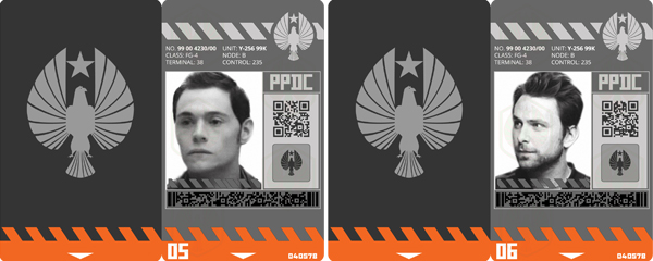
Because some nerd on Tumblr realised that the pilot badges in the art book aren’t actually screen accurate, and some other nerd found screen-caps of Burn Gorman and Charlie Day which look super dang close to the photos on Hermann and Newt’s badges respectively (and may well be the actual images used)?
Hint: It’s me. I am.
The main change, aside from the photos, was the stripes along the top edge of the cards. In the previous version those were dark grey, now they are a much lighter grey, matching the PPDC bird-logo they intersect.
The spacing of the stripes on the lower edge has also been adjusted, so they flow smoothly and continuously into each other. Even between cards.
A badge has also been whipped up for Tendo Choi:
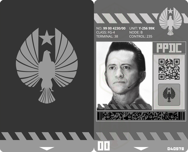
Tendo Choi ID badge.
Getting a clear look at Tendo’s ID was even more frustrating than it was for Newt. Like, damn son! Why you gotta clip that on your pants?
00 has been stuck on the inner corner, but truthfully? I’m not sure if Tendo even has numbers there? It’s quite difficult to see for sure and he’s one of the few characters who doesn’t specifically have a ‘partner’ as such, more-or-less being equally helpful to everybody; so numbers denoting a pair don’t seem as important in terms of the symbolism for his character.
Tendo’s badge differs from those of the K-Science boys in that the border along the lower edge is grey, rather than orange. This, one assumes, is a J-Tech thing.
The Jaeger pilot badges feature a blue border, though I am unsure if this is specific to Gypsy Danger, the other teams may have different colours (or straight up different badges altogether, I haven’t looked that closely… yet).
Mai is, like, the ‘Sherlock Holmes’ of being a dork.”– MaEmon, via Facebook
Such attention to detail has, inevitably, led to an artistic dilemma of sorts upon the realisation that, in the section adjacent to the photo, below the QR-code, where the bird-logo sits, the pilot badges used in-film feature the logo of their Jaeger. It makes sense, I mean, there are two of the PPDC birds featured on each card already, having the third there seems kind of redundant.
However, from what I can see of the J-Tech and K-Sci badges, they do just have a third bird there? Unless we’re to go along with a couple of heated nerd-debates I’ve witnessed online (the only kind of argument that matters) which believe that a Kaiju-alarm logo should feature on the K-science badges instead.
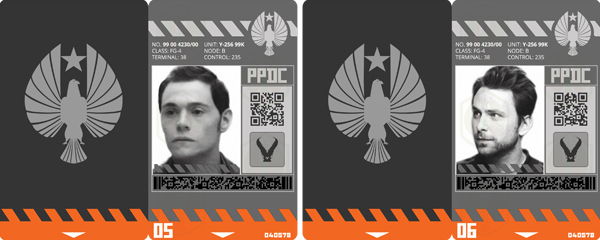
Even if it’s not screen accurate, I actually kind of like it this way? Like, bird for J-tech dudes because those guys help everybody out, Jaeger logos for pilots so we know which team they’re on, and Kaiju for K-sci bros because they science the shit out of those monsters.
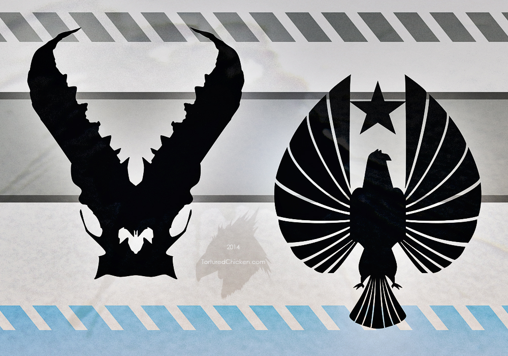
In the end though, I decided to stick with screen-accuracy over creative distortion. Persuasively argumentative geeks aside, it looks more like a centrally-dense shape- such as the PPDC bird (while the Kaiju splits in half and tapers like a ‘V’).
See what I mean? Distinctive silhouettes. Paired with simplicity. A fundamental part of any recognisable design.
… I’m sure there’s a better word for that.
In any case, I’ve gone out and obtained my very own laminator courtesy of Aldi supermarkets!
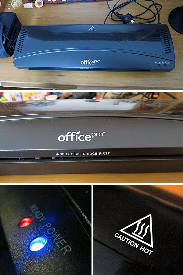
It can laminate anything up to A3 in size and so far seems to be doing a pretty solid job of it.
This time around I’ve opted for a semi-gloss photo paper, and smaller laminate pouches.
The pouches each stand approximately 86mm tall by 54mm wide, while the cards are closer to 81X50mm.
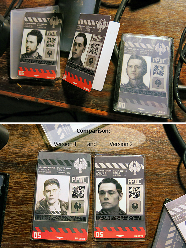
Printed by my trusty Canon Pixma iP7260. Love that guy.
The decision to roll with a smaller size came about because version 1 of the cards didn’t quite fit in the badges once laminated, and trimming the laminate caused issues with splitting due to the thickness of the folded photo paper. Smaller cards and pouches meant that trimming was altogether able to be avoided.
Which brings us to the completed photographs of PPDC ID version 2:
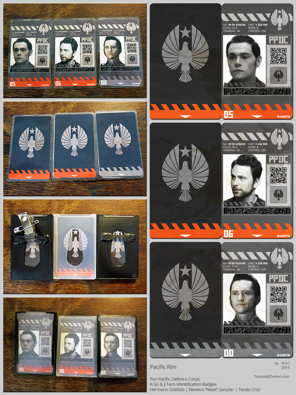
Guess I better go fix up the image in that other entry for the sake of chronological consistency.
The cards were drawn up using vectors, while the photos and textures are rasters (from photographs).
A last note before signing off; in the not-too-distant future I’m hoping to organise a public Google Drive or something in order to freely and easily share high-resolution cosplay resources (images I’ve uploaded here, on dA, or Tumblr, and wherever else are all 72dpi, not really suited for quality printing).

