This is an image-heavy entry.
Because that book, the one I’ve been working on based on Journal #3 from Gravity Falls, is finally finished. As many pages as I was able to dig up references for have been filled out.
Even references which were unclear or inconsistent were fair game.

Side note: if you use the wrong colour by mistake acetone is a really shitty way of removing pen ink from paper. But was the best I had on hand in a pinch and worked well enough that I didn’t resort to tearing out pages.
We’ve already discussed how I spent the better part of more days than were readily admitted to spilling tea and coffee all over the pages. We also discussed the design and construction of a map-hat which could just as easily have been avoided altogether were I a more efficient less thorough individual.
So. Yes. Felt tip and ballpoint pens and markers in varying degrees of black, red, and blue.
Much of the staining on the pages was done prior to writing on them- this probably doesn’t need to be reiterated for the millionth time. Stain them before writing, otherwise your ink will smudge. Except that a little more staining was added afterward too, with food dye. Because… why not?
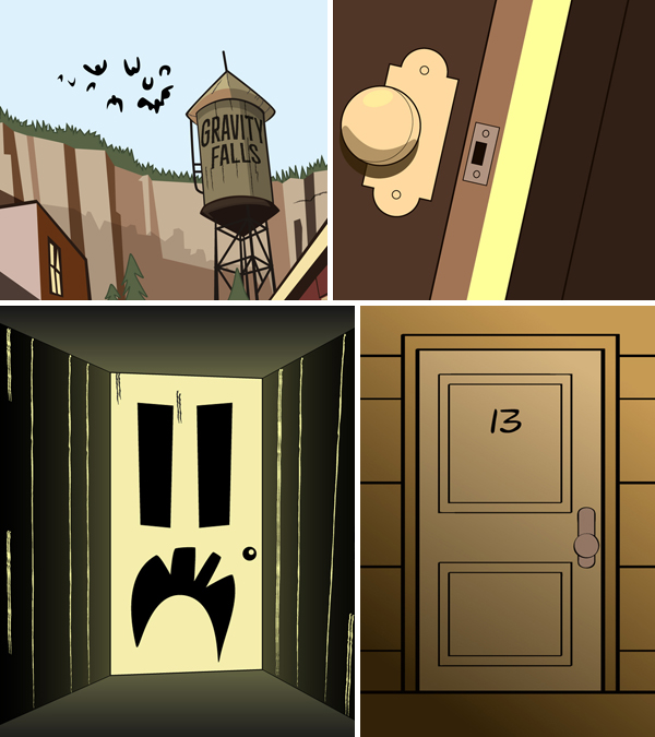
Gravity Falls journal #3, vector evidence photos.
If a couple of the pages were looking a little bare, that is because space was left for evidence photos. Drawing them in by hand certainly would have been doable, but taping physical items in there is a lot more fun. In case the whole Conspiracy Map thing didn’t clue you in to that already.
Items also add bulk to the pages, helping it to look more tattered. Which is a good thing. Trust me, I am a professional.
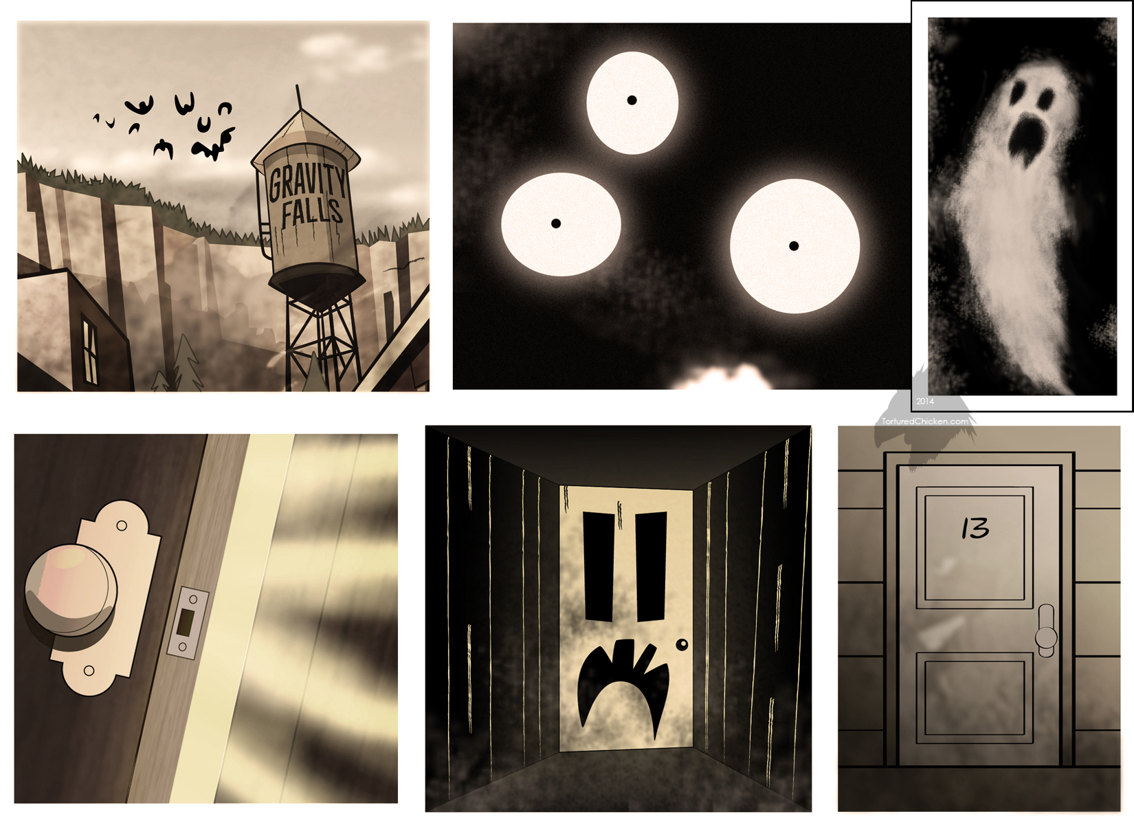
Gravity Falls journal #3 evidence photos.
There are six evidence photos, three for the Cursed Doors pages, one for the Ghosts page, one for Floating Eyeballs, and one for Giant Vampire Bats.
Floating eyeballs and the ghost were drawn up as raster images, while the others are all predominantly vector, with raster textures added afterward.

Evidence mock-up.
Once I was happy with how the images looked a mock-up was printed on plain paper to gauge colours and sizes. Satisfied that everything appeared to be in order, it was time to print the final.
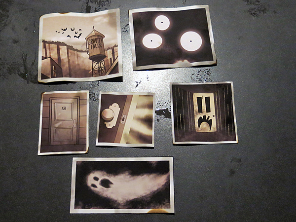
Yes, these are drawings. No, they are not actually photos. However, I will continue referring to them as such for the sake of the costume. Suspend your disbeliefs with me.
Once drawn the photos were printed on matte photo paper, cut, lightly burned, gently sponged over with instant coffee and food dye, torn apart, taped back together, then finally affixed to their respective pages inside the book.
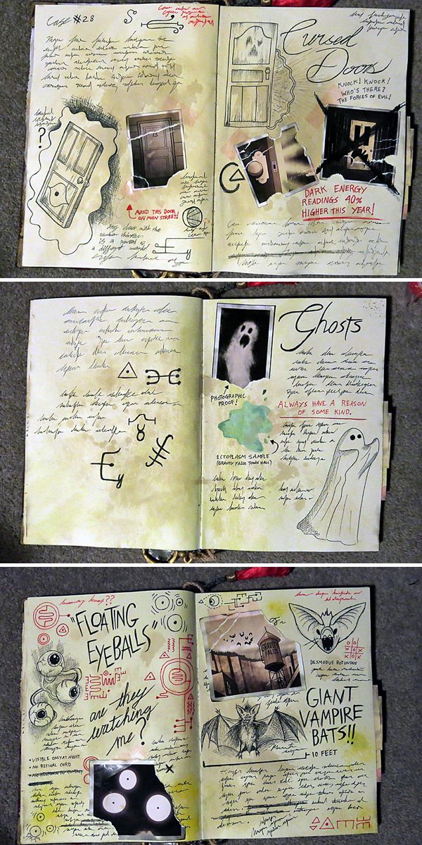
Finished pages, now with added evidence.
The tape holding the photos to the pages is purely aesthetic, I opted to use craft glue as the main adhesive there in order to minimise the potential for items falling out of the book. As tattered as I want it to look, littering is not something I condone, so it is in my best interests that everything remains intact (aside from the map, that can be taken out, but this entry is not about maps).
One last item was the tassel at the top of the book. Similarly to the eyeglass, it is held in place by a length of plaited acrylic yarn (in this case grey, rather than beige) which has been glued to the centre of the book. Tied to the end of the yarn is a length of red ribbon held in place by a bead wrapped in gold ribbon and a whole lot of glue for the aforementioned reasons of overkill thoroughness.
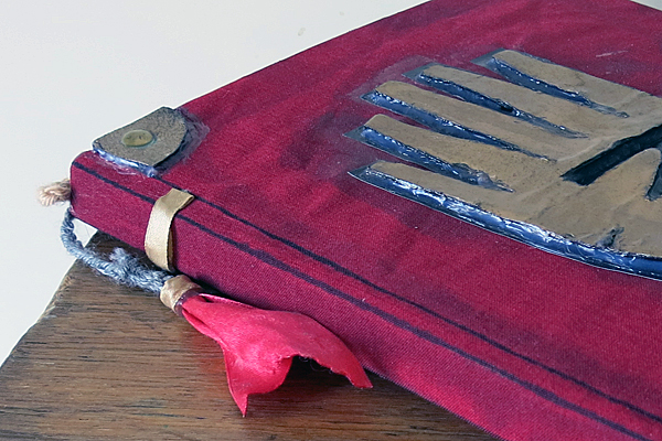
The tassel was one of those inconsistent points of reference where at first I figured: “Meh, don’t need it.” But later concluded: “Eh, why not?”
Much of the writing in the journal is illegible gibberish scribbling, because cursive is not my forté. In fact, you can easily spot the difference between the scribbles and the cursive because the scribbles are visibly neater.
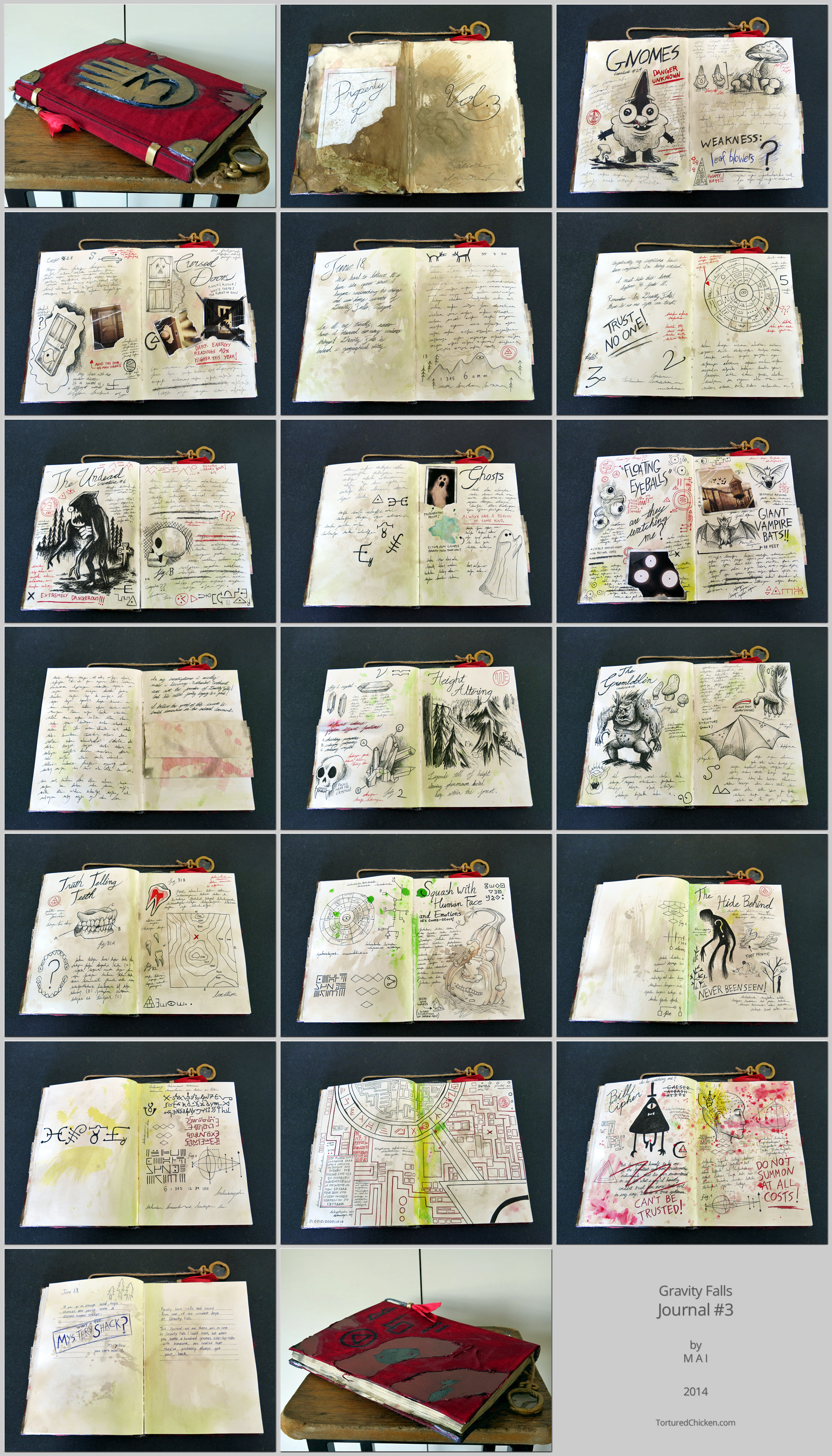
Just going to throw it out there that the pages were not addressed in any particular order; that is- an order which made sense to me and involves intermittent blank pages, but that may not accurately reflect the canonical order of said pages- if a consistent canonical order has even been established.
More effort went into this book than the clothing portion of my Dipper costume. Which was discussed over here for anybody who is curious.
