
Some time ago I begrudgingly began rebuilding the Asylum for better responsiveness on mobile devices, since that’s the way the way people are currently headed despite my best efforts to discourage them.
Unfortunately, aside from telephones, I was also deeply resentful of all my hobbies at that time and wound up pushing the project aside.
Recently, with the big KonMari inspired cleanup of my online identity, social media accounts, and life in general, I remembered how enjoyable it is to fuck around with shitty HTML and JavaScript I will never fully understand- ultimately managing to release the new site.
It looks more or less like the old one but now it’ll kind of layer itself and scale down for smaller handheld screens instead of… that thing it was doing before.
Not that the previous version was unusable or anything, it just wanted to load everything within specific size dimensions which were not specified with mobile devices in mind.
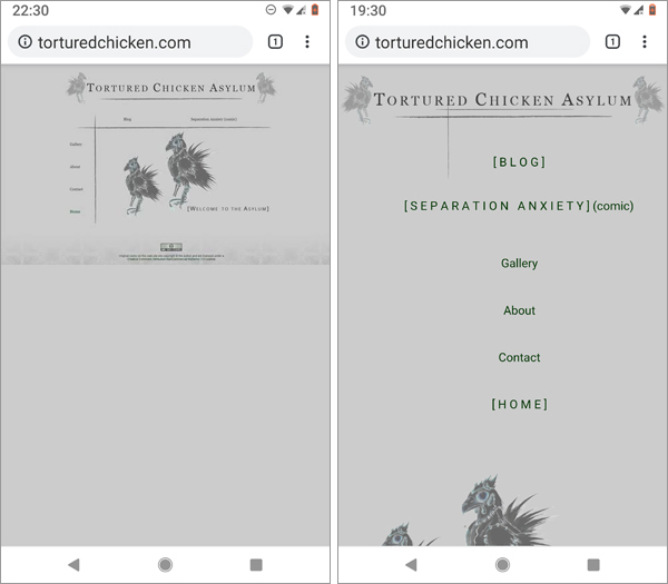
Image for reference, what it was doing vs. what it does now.
Does the preference to specify sizing show my age? A habit born of an era built from the structural reliability of tables? Or is it just another neurotic manifestation stemming from my compulsive need for absolute control?
Not a total mess, but ugly.
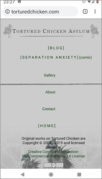
The footer warrants some discussion, as the time spent working on it was quite a bit longer than I’m willing to admit. You see, for viewing on a desktop browser, setting the .CSS position to Fixed gets it hanging out at the bottom of the screen. However, this behaviour also had it wanting to hang out at the bottom of the phone screen- where it overlapped the main content.
Alternatively, having the position set to Relative would push it to sit below the content on a mobile device, but sitting far too high up on a larger computer screen.
By adjusting the margins with a Fixed position I could make it so there was enough space to scroll the content above the footer, but that was a cheap fix which didn’t really solve the problem.
A quick chat with my Dad reminded me that it is in fact possible to set both Fixed and Relative behaviours, then let the browser select which one to use based on viewport size.
So basically, if the browser window is above a certain size then the footer will sit at the bottom of the screen, but if it is below a certain size then the footer will be pushed down to sit beneath the content.
Final footer success.
Truth is I have difficulty figuring simple things out because I exist in this intermediate liminal space of not being a beginner but also having very little formal education in web development. So when somebody with any discernible qualifications hears that I once attempted to attach a string to a boolean all they can do is look on with pain in their eyes, knowing I will never understand what that means.
The real adventure is in the stylesheets we broke along the way.
Part of me wants to say the broken .CSS is what the Asylum originally looked like, but man, it was so much worse.
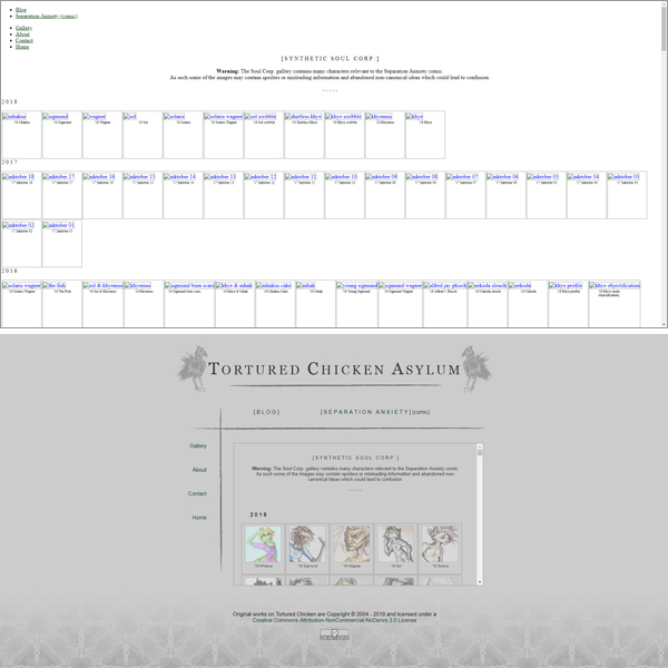
The above images are a metaphor for me when I’m over caffeinated and have been awake for >72 hours versus me when I’m well rested and have eaten something of discernible nutritional value.
In any case all appears to be working in a more or less satisfactory manner for the time being.
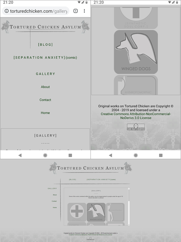
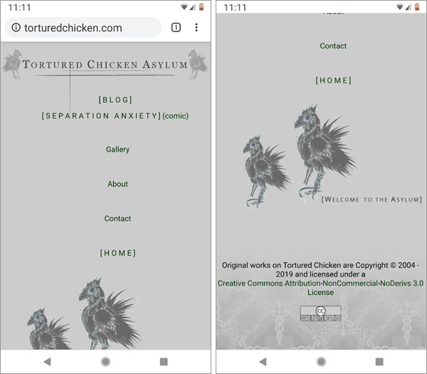
Top: Mobile display. Bottom: Desktop display.
While riding out this cleaning rampage most of the content has been pulled from Separation Anxiety. Unfortunately I burned out and it’s been stuck in limbo since 2014. At an indeterminate point in the future I very much would like to resurrect it (hence the empty site still being up), but it will likely take a different direction than initially planned.
Lastly, my deviantArt account name has been changed to TorturedChicken, which pretty much means all the social media accounts I’m still using are cohesive now? Feels… oddly satisfying. This is actually the second time I’ve changed my dA name, but I figure I’ve been using their services for 14 years, the least I can do is throw them a few dollars for Core membership here and there.
Haven’t felt any real connection to my old online handle for a long time so it felt overdue to get rid of it. Double down on Tortured Chicken, maybe even tell people my real name like an adult?
But who knows? Maybe I’m catfishing the long game.