Costume progress.
After some thought on the matter I decided to slip a couple of (very small) shoulder-pads into the Junior Warrant Officer Schrödinger shirt.
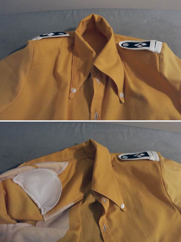
Some people have strong opinions on shoulder-pads, saying that they should not be used if you are feminine or have poor posture because all they really do is end up drawing attention to the fact, but if that were true then only male body-builders would ever bother getting a nicely tailored suit.
The trick is just to not get too 80’s about it, you know? That way all of our office workers who perhaps don’t follow their ergonomic OH&S practices as thoroughly as they should can still groom themselves to rather a handsome triangular silhouette.
Okay, my feelings regarding corporate attire and the fact that there is a lot more going on in the construction of a suit than just shoulder-pads aside; I spend a lot of time in front of computers and use this as my go-to excuse for having, well, sloppy posture. I’m also quite feminine in appearance, androgynous at best, but never downright masculine.
This is fine though, being androgynous works when you enjoy being massively camp and mostly only cosplay teenage boys anyway.
But why the shoulder-pads in a shirt?
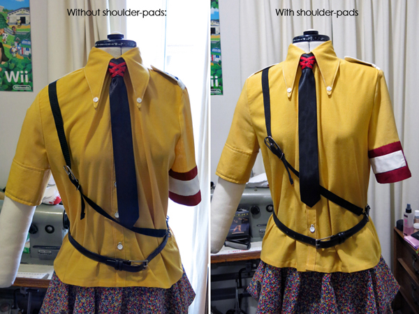
Obviously it looks better on somebody without pointy mannequin boobs. But hey, it’s not my fault she’s a Madonna fan of the Blonde Ambition era!
It’s subtle, yet dramatic. The addition of shoulder-pads gives the entire shirt a more square silhouette without being overwhelming.
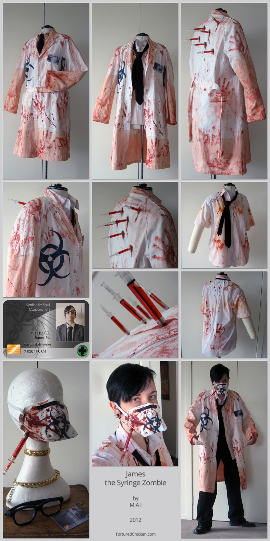
Last year I had great success with shoulder-pads applied to the lab-coat of my zombie-surgeon/scientist costume:
Not only did they give him a square silhouette, but they also made him appear taller and slimmer.
As I’ve said though; the trick is not to overdo it. Think about the size and shape that would work best for the cut of the garment (a raglan shoulder-pad is a completely different shape to that used for a set-in sleeve). Enforce additional structure within the garment using interfacing (again taking into consideration what is and isn’t appropriate; heavy woven fusing and canvas are great for suit jackets, not so much in a shirt). The thinner the fabric is the more obvious any padding will be. In some cases they will be unnecessary or too obvious and unreasonable. In other cases you may be able to fashion your own shoulder-pads out of the main garment fabric and a light-weight stitch-in interfacing.
Experimentation, yo!
Back on topic, Schrödinger’s shirt has finally got pockets:
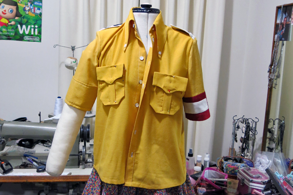
Which I promise are way less crooked in real life than they are in that picture. I just kind of threw it on the mannequin and took the photo, forgetting about how her single arm likes to unbalance everything.
Expect to find finished photos sometime this week (assuming I don’t get too caught up with other nonsense).
The important thing is, he’ll be ready for Manifest, which is from the 16th to the 18th of this month (holy shit is it August already?)!
My pass arrived earlier this week.
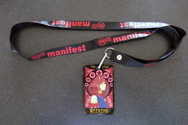
It arrived the same day as I received the confirmation email that they’d posted it. That seems to be happening to me a lot recently. No complaints here though, not having to wait is a fine thing indeed.
The design this year is really lovely! Like a Tarot card. This year’s theme is “Light Vs. Dark” though I don’t tend to follow the themes too strongly, maybe Schrödinger and Alucard could fit it in a pinch, since they’re from opposing organisations? Then we can all sit around arguing which one represents light and which one represents dark. Or not…
Point is, I’m unreasonably excited. The surprise journey to PAX the other week really got me into the mood for cosplay and conventions.
I’m also stupidly excited for Halloween because my life is sad like that.
Now feels like as good a time as any for an art-dump.
First up, fresh from the Soul Corp. page in the Gallery, a whole lot of Wagner and Sol due to some emotionally crippling dreams I had about them recently:
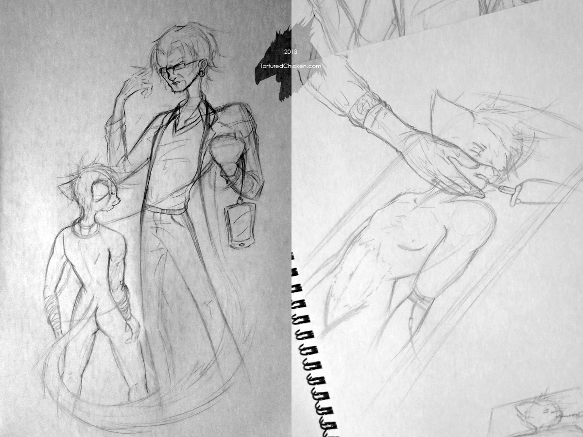
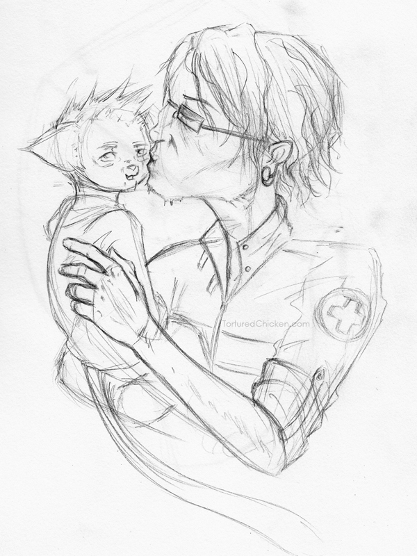
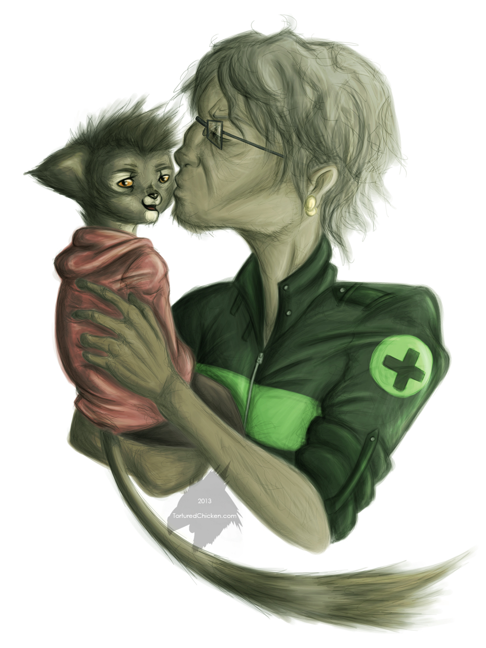
Not that I wasn’t already emotionally crippled anyway.
Second, three more entries to the “30 Days of Porn” meme/artist challenge thing.
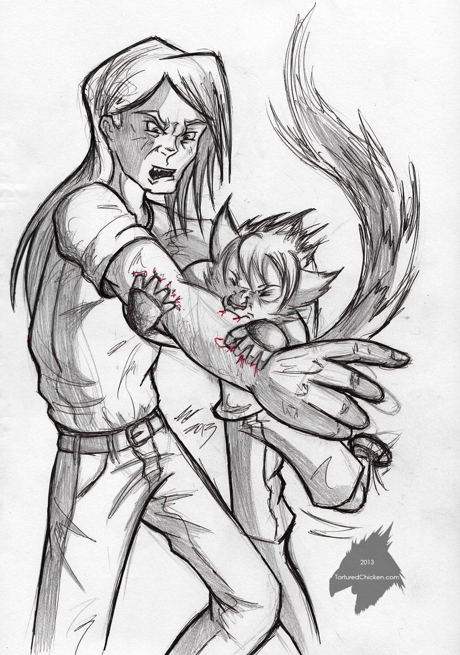
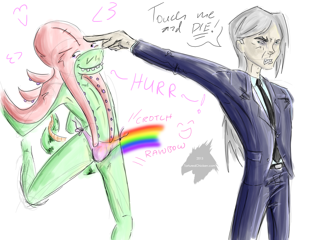
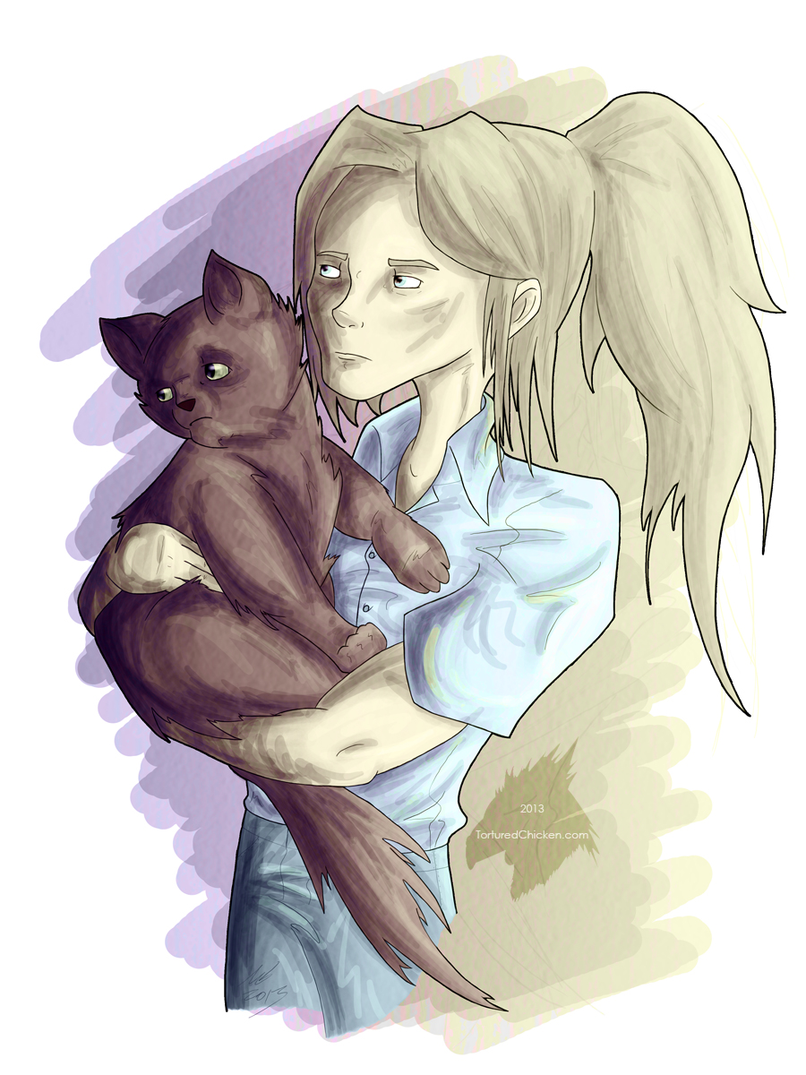
Please keep in mind that I’ve been following these prompts with the intention of making them as non-pornographic as possible and am actually seriously questioning the ethics of day 25; particularly when taking into account that I found the meme on Fur Affinity.
On day 23 Khye learned that biting is fucking painful, Mhak’s octopus hat from day 6 made a dramatic return on day 24, and on day 25 the fact that Khye likes cats best was reinforced (though unlike any perceived relationship Khye may or may not have with Sol, his relationship with Charcoal- a regular, ordinary, non-therian, domestic feline- was purely platonic, and I genuinely wish we lived in a reality where that didn’t need to be specified, yet here we are).
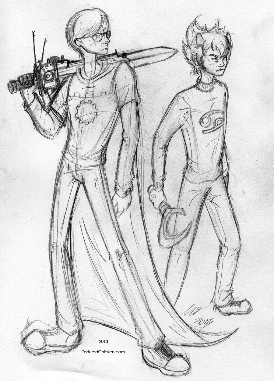
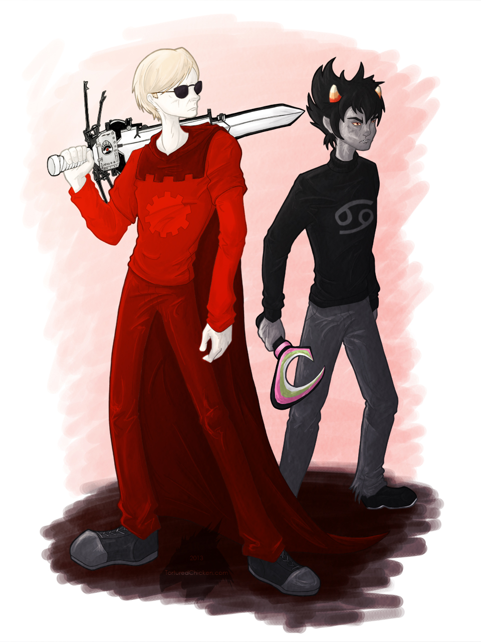
Lastly, gratuitously bromantic Homestuck fanart has been coloured!
Not a whole lot to say about those. But there’s some WIP stuff on Tumblr if you’re into that sort of thing.
Speaking of the sorts of things you might be into, I tried to set the Evangelion theme “A Cruel Angel’s Thesis” as my town tune in Animal Crossing: New Leaf.
A _ C _ D _ C _ C D D G F E D E
Considering the limited space provided and complete lack of sharp or flat notes, it has been deemed a success!

